Anointed Tea Company
Class
Design I
Year
12/5/2025
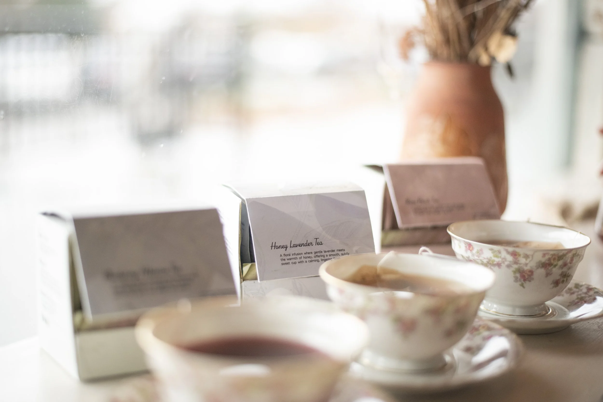
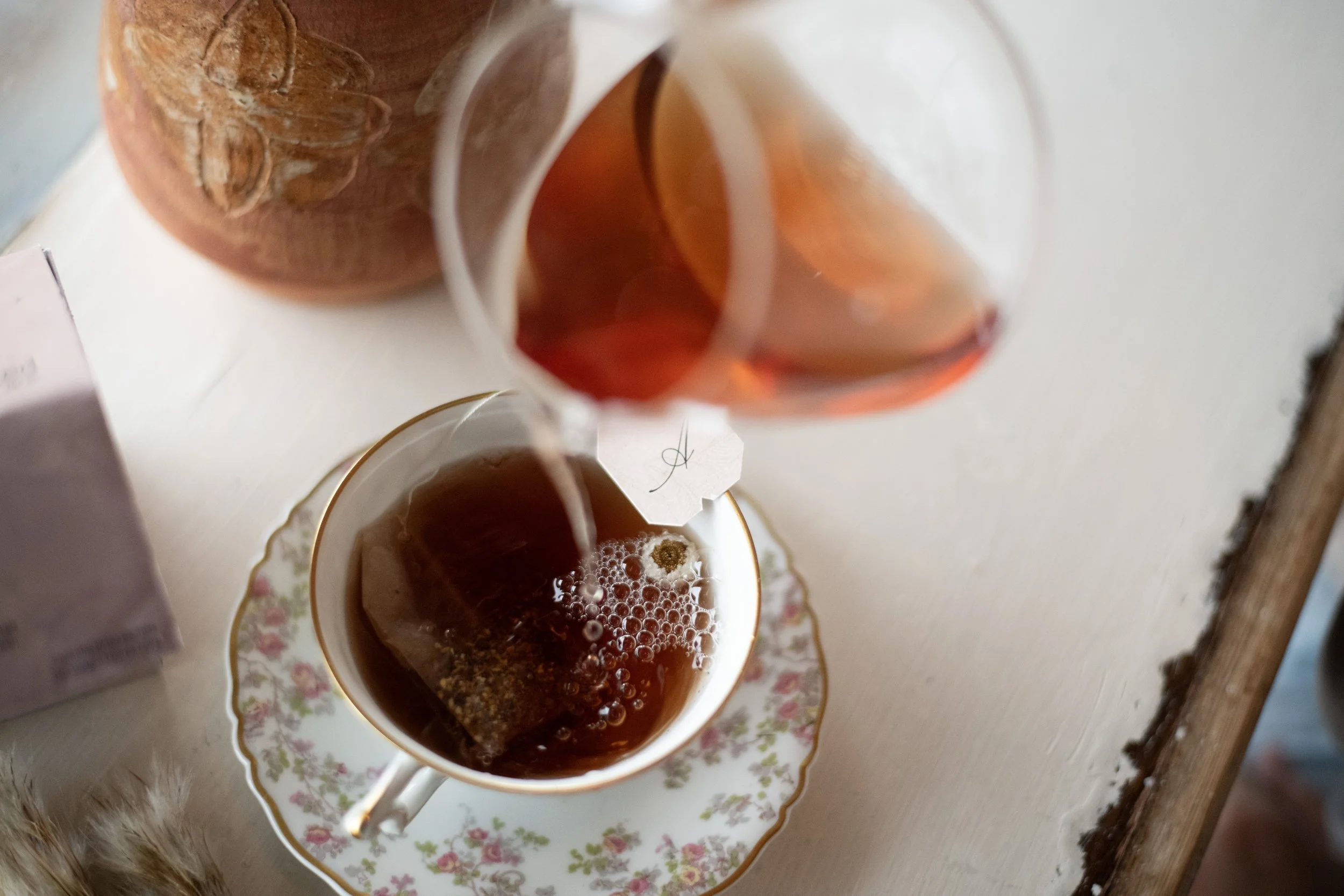
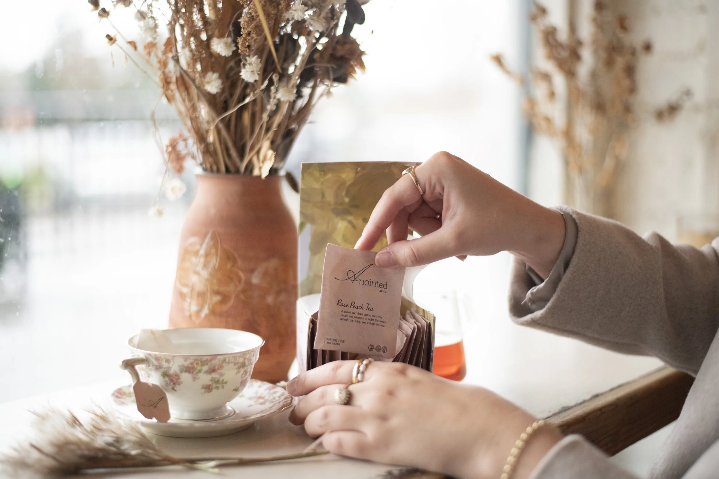
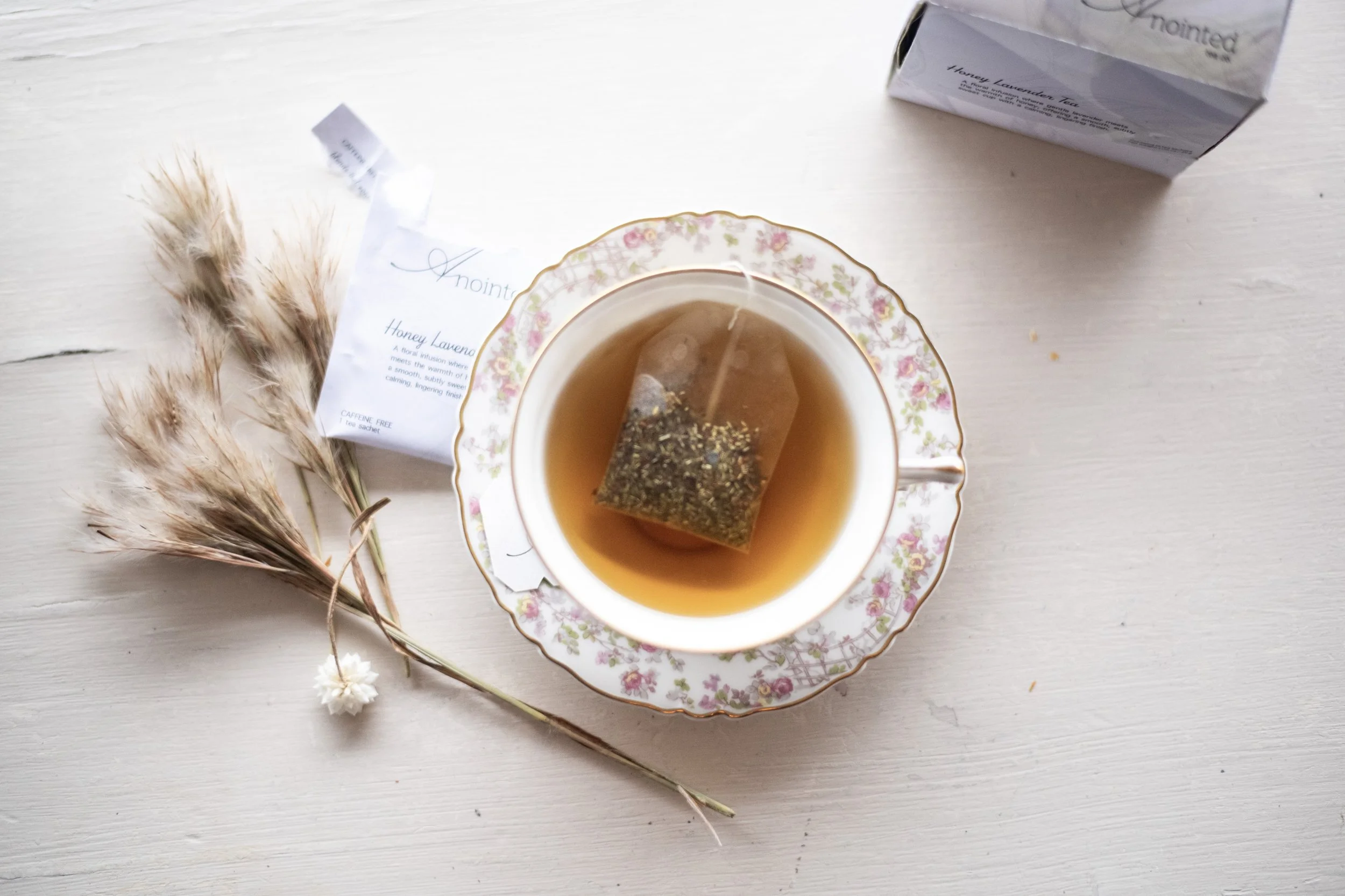
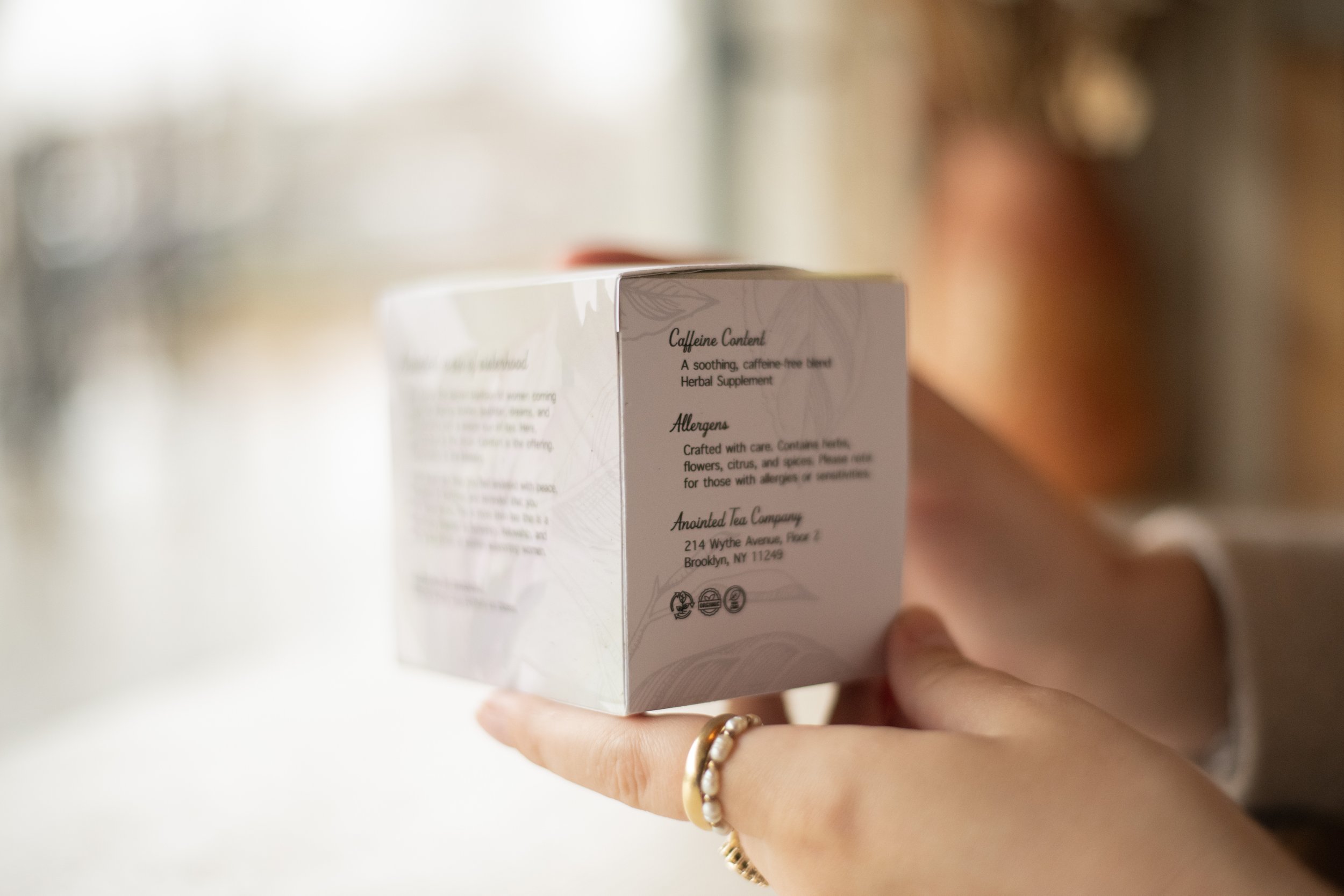
This project was to pick a three-product suite that needed a functional package design. Picking Tea was a fun challenge because it was a challenge to look beyond the basic tea box and create something that is not seen in stores, so it would jump off the shelf if it were a real product. The goal for Anointed Tea Company was to create a feminine and elegant design that would draw a female audience in and communicate their message of gathering with other women and sharing a glass of tea and meaningful conversation. Communicating all of this through a box that most people would skim over in seconds was the first challenge that came to mind. How could this be solved? Creating a visually interesting design system that would make the viewer want to stop and pick up the package was how this challenge was going to be solved.
Anointed Tea Company’s product suite ensures consistency through using the same box dyeline for each flavor of tea while also using a color palette where the viewer can tell that the products are meant to be seen together. Also, by singing the same photograph on each of the boxes to create some visual consistency, just with different color overlays to ensure the viewer knows the brand identity, but can also tell the difference between flavors almost immediately. The visual research conducted to inform Anointed Tea Company’s design decisions was pretty extensive. Going to several different stores and looking through the tea section to see what was not already provided. I noticed that the boxes just were not very pretty, and if they were pretty, then the information was a bit harder to find. My goal was to reimagine this effect!